When I'm a UX designer, I often hear things like "Rakuten's site is the best in Japan" or "Rakuten actually has the best UX design," but the beginning of the matter is mr. Fukazu's famous remark in the UX world.
It is true that Rakuten's composition attracts what you see and motivates you to buy.I think that was the case with rakuten sites at least 10 years ago.I bought the information I wanted and what I wanted to buy at Rakuten.But is Rakuten really the perfect form of site design?Today, I would like to write an article for those who have doubts about Rakuten's design.
Is Rakuten's design really a complete form?
In conclusion, it is NO.
If anything, it can be said that the design of Rakuten is a baked blade.)In the past, there were LP and product photos related to products on the product page, which was very easy to see, and searching was possible, but when you look at rakuten these days, it takes a lot of time to enter the product page and see the actual product.You may be trying to motivate them to buy by showing other products before showing them their favorite products, but the next visit will miss out.This is because customers are not coming to Rakuten to enjoy shopping, but because they are cheap.As proof of this, there are more customers who come from price COM and blog Affiliate than users who purchase on Rakuten site.This indicates that Rakuten is no longer functioning as a site to convey the appeal of the product.
An event that lost more than 20 minutes by rakuten's purchase lead
Here, I would like to talk about the recent events I faced.
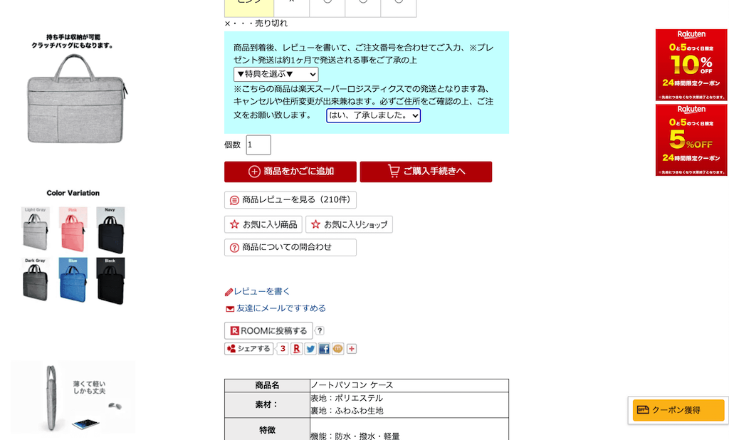
I was messing with Rakuten's site last week and faced a problem.It was very difficult to choose the color of the product when choosing the color of the product.The screen at that time is here.

Why 20 minutes!?You may think, but this shop of Rakuten was the cheapest and there was also Karabari, so I couldn't give up even if I couldn't find it.
I missed the story, but how do you think you choose Karabari from the image above?Think about it for a moment.
5
4
3
2
1
・・・
The answer is to click on the table.It's easy, isn't it?

Or rather, if it is the above design, it should simply look like a table of inventory status.It is also questionable that Rakuten did the user test properly, but I thought that I could choose Karabari after putting it in the shopping cart because I did not understand this, and there was no reaction even if I put it in the shopping cart.It is not found even if it looks for the place where the color can be chosen on the site.I'm really tired.It is a surprise because Rakuten takes a profitable store opening fee every month by this.Amazon only takes sales commissions, so it's conscientious.
Summary
Today, I talked about Rakuten's design.There is no doubt that Rakuten is the best e-commerce site in Japan, but recently I feel that it is because of the goal to take the numerical value, or because of the design debt, and it is left alone.It will have a few more years, but unless you make a fundamental improvement in the design in a few years, you may end up with a site where you can only earn a certain number.