I recently bought a Macbook pro cover on Amazon, when I chose a size and arrived at home and tried to put it on, I wasn’t hooked at all.Obviously the size difference.
I thought that this was a mistake on the shipping side, and when I checked the order table, it turned out that I had ordered a product of the wrong size.I was disappointed with my stupidity, but when I analyzed why I made a mistake in the order, I found that there was a serious flaw in Amazon’s UI.I’d like to take up Amazon as a bad UI example today.
In advance, I would like to say, Amazon is a very easy-to-use service that is not as great as Rakuten in Japan.It’s a variety of UI efforts that Amazon does, and this time it’s just off, and that doesn’t mean that amazon’s UI is all bad.
UI that leads users to the wrong choice
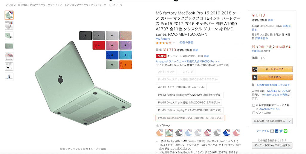
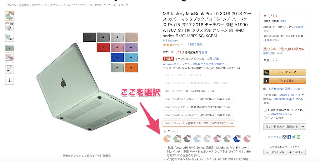
First of all, please look at this picture.There is a cover of Macbook pro, you can also choose the color variation.It seems to be an image that does not change anything.

First, choose a size.I chose it because the sys I wanted is a Pro15 Touch Bar model (2016-2019 model).Next, the color is orange, so what do you think will happen if you choose orange?

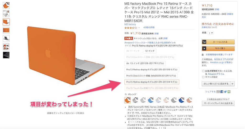
What?Don’t you think oranges were chosen normally?
I think that the majority of people think, but let’s choose once.

What a thing!?It has been changed to the size of the Pro15 Retina display model (2012-2015 model) without permission.I understand it if I look closely for sure, but if I choose the size and karabari if it is normal, I put it in the cart as it is.
Why did such a tragedy happen?
So what’s wrong with this design?
The biggest factor is that it causes behavior that is contrary to the user’s expectations.The user’s expected process is
Size →Karabari→Shopping Cart
It’s a step, but it’s this UI and
Size →Karabari →Check size →Shopping cart
It becomes a flow.By showing behavior contrary to the user’s intentions, the user buys the product without confusion or notice.
Amazon’s shop description says that it is careful because it buys by mistake in size, but what was wrong is not the wrong size, it is a problem of Amazon design that led to the wrong size.
How should Amazon change the UI?
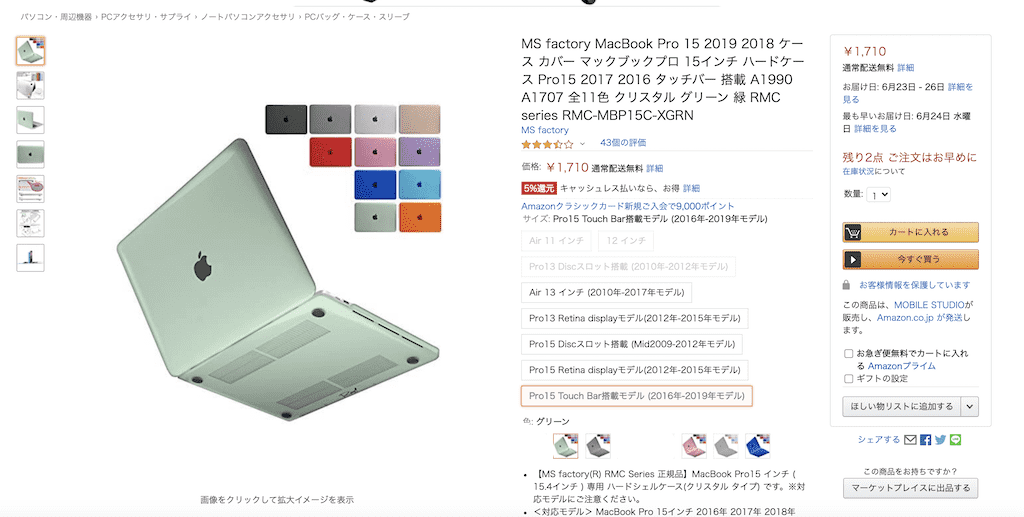
What kind of UI will solve this problem?I’d like to show you an example here.Amazon also displayed colors that do not exist in size in the first place.It is made semi-transparent once, and the presence is lost, but there is no reason to exist until it is thin.Therefore, unnecessary information is never accidentally prevented.

Yes, that’s it.I erased the unnecessary karabari that had been up to now and was made to display only what can be selected.This will reduce user mishandling in the future.
Summary
How was it?Design has the power to bring users to happiness with just a small change of design.In this case, we made the user’s shopping experience better.You can also improve your daily design skills by analyzing sites that are difficult to use or that lead to mistakes!Let’s do our best!


